How to use the COVID-19 Multimodal Transportation System Performance Dashboard
As of July 31, 2022, we are no longer updating the COVID-19 dashboard but will keep it available for the time being as an archive for travel information and data collected during the pandemic.
How to use this dashboard:
About the COVID-19 Multimodal Transportation System Performance Dashboard
WSDOT developed its COVID-19 Multimodal Transportation System Performance Dashboard to keep Washington citizens informed about the impacts pandemic-related closures are having on multimodal transportation statewide. This detailed analysis provides daily updates on where these changes are most pronounced and provides an accurate look at exactly how, when and where certain measures (e.g. Stay Home – Stay Healthy) affected transportation statewide.
Performance summary page
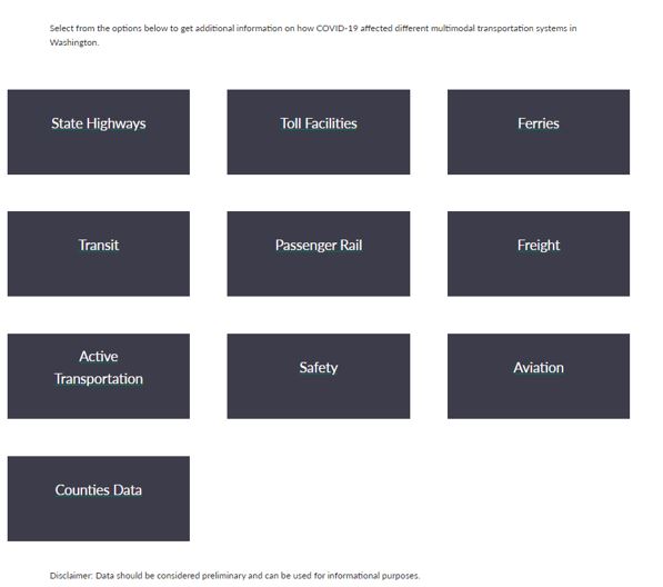
This page provides summaries on five key transportation performance modes (State Highways, Toll Facilities, Ferries, Transit and Passenger Rail), including the latest data compared to the 2019 baseline through sparklines and tables. It also includes links to additional data and information on these modes as well as on other performance measures on topics ranging from Freight, Active Transportation and Aviation to Safety and Counties Data.
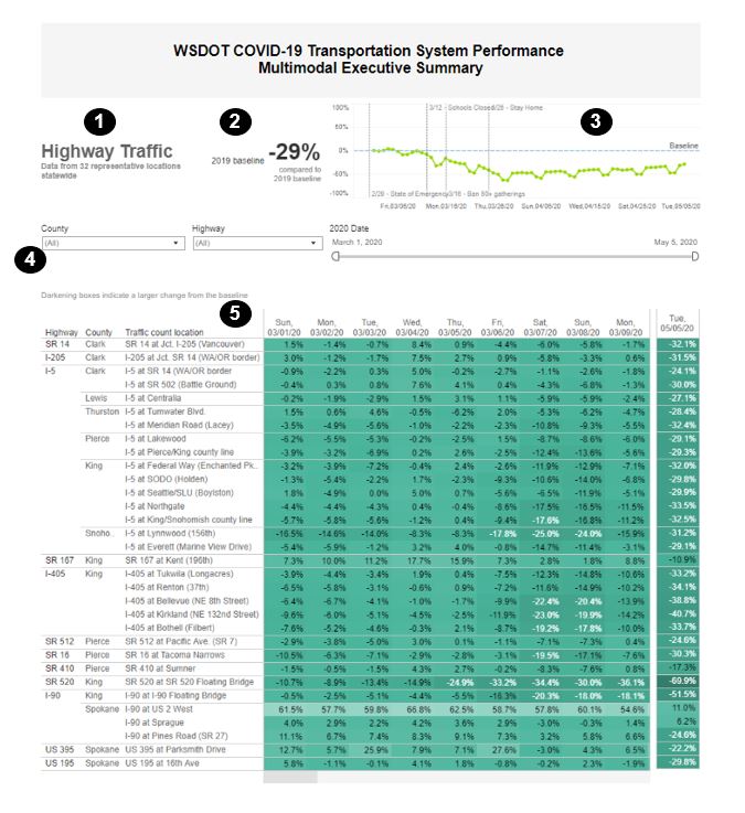
The summary sections are divided into:
② Percentage change (based on the most recent available data) compared to the 2019 baseline
③ Statewide trend over time shown in a sparkline format
④ Drop-down menu filter to select different items (e.g. counties and highways)
⑤ Day-to-day data in table format, showing percentage change over time and for the most recent day
Detailed individual system pages
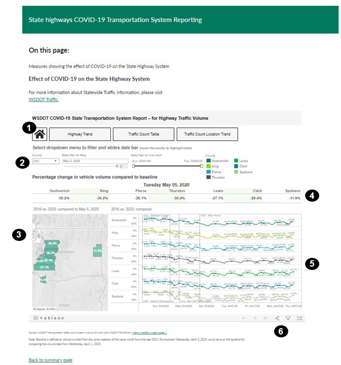
② Drop-down menus provide filter options to select different items (e.g. counties and highways) and a date bar allows the user to select specific days
③ Maps show where the impacts are occurring and provide a view of how things are changing on a larger scale
④ Daily updates show the latest changes for certain modes, counties, highways and routes versus the baseline
⑤ Sparklines and other visual information (such as charts and graphs) make the data easier to follow, showing drops and increases in an a way that is easy to follow and understand
⑥ Dashboard tools provide copying, full-page and download options
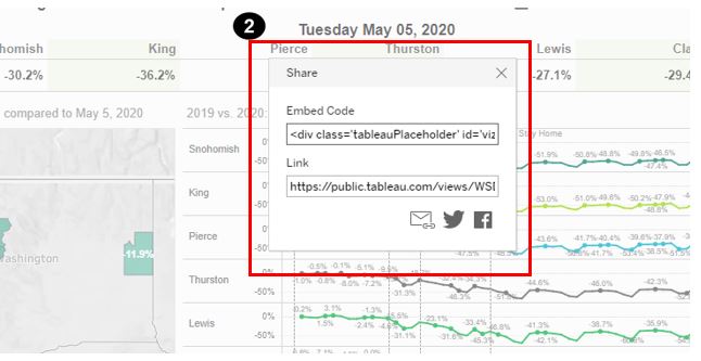
② View a direct link to the dashboard above, and code that can be used to embed the dashboard in your webpage
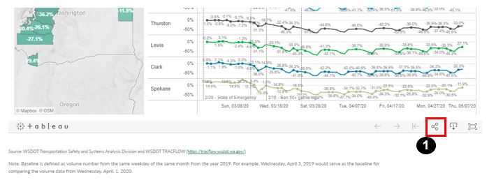
③ Download and share the page as an image, PDF, etc
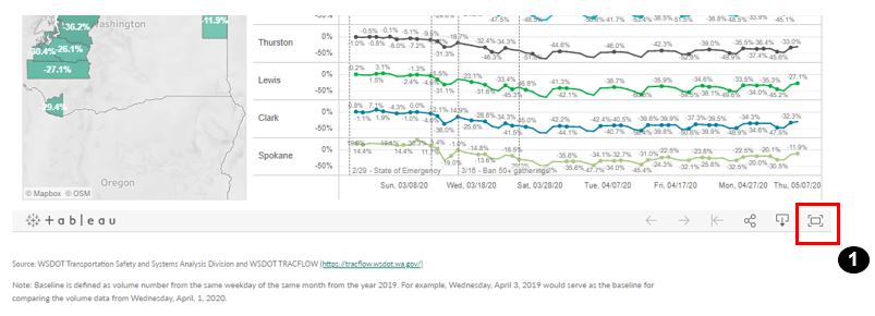
④ Enter full-screen mode

Top of page
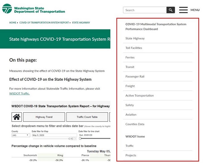
Navigation
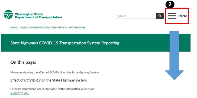
This dashboard uses three navigation menus:


Top of page
Downloading data
② To select partial data, either click on a column (to highlight the entire column) or select a section of the table and highlight that
③ To select the entire chart, hover the pointer here and click
④ To select a row, click on that row
⑤ Download 1-4 into formats ranging image and data to PDFs by selecting the download icon. (Note: Downloading this data works best in Google Chrome)
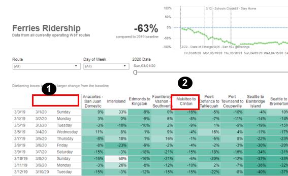
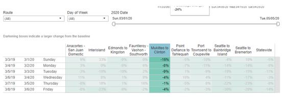
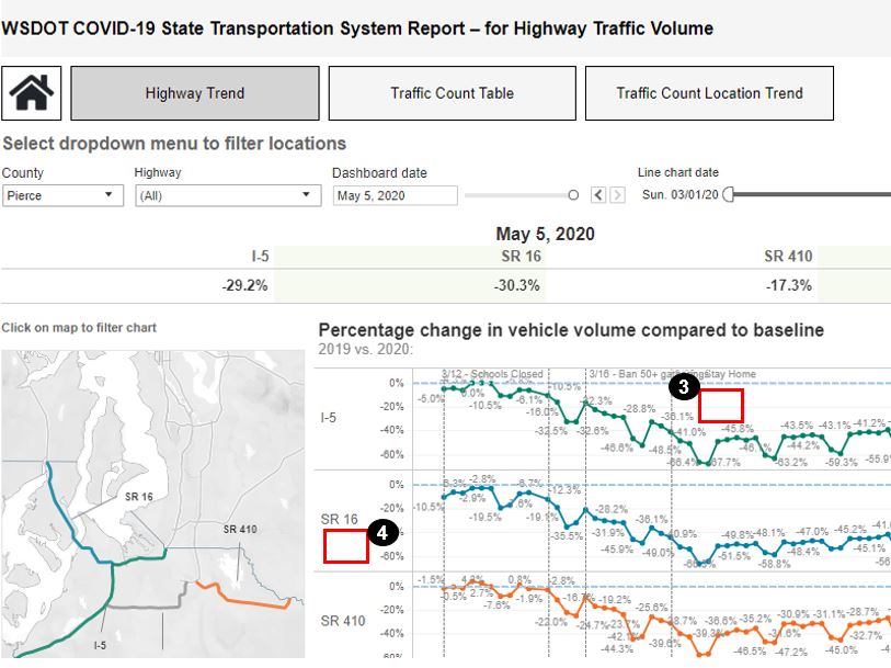


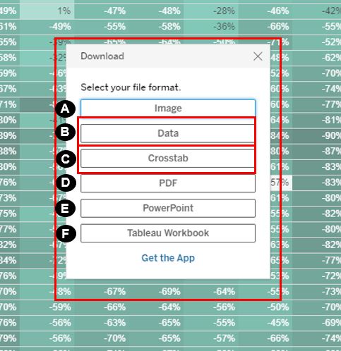
After clicking on ⑤, the following options will pop up:
B) Data that includes the backend data from a chart or table
C) Crosstab data (in a csv file readable in Microsoft Excel) of a chart of table
D) PDF image
E) Image on PowerPoint
F) Tableau Workbook
Sharing the dashboard
② Copy and paste “Embed Code” to embed the chart in a website, or use “Link” to share the information via email
Accessing full screen mode
Top of page